Webz Basics Walkthrough
Table of contents
Key Idea
Webz can be used to create an interactive website.
This walkthrough will help you build and deploy your first Webz application. You will learn how to create components, bind values, and handle basic events.
0) Setup
- Use the Github classroom link provided in the original assignment on Canvas to create your own copy of the starter repo.
- Clone the repo to your local machine in an appropriate directory.
- Open the directory in VS Code, as you normally do.
- Run
npm installin the VS Code terminal to install the dependencies.
npm install
- Run
npm run startin the terminal to start the development server. This may take a few seconds to compile the code and start the server. If you need to stop the server, you can pressCtrl+Cin the terminal.
You can click here to see what the output looks like for us when the server starts successfully.
Keep in mind that the details of your output may look different!
> hw8-webz-basics@0.0.1 start
> webpack serve

<i> [webpack-dev-server] Project is running at:
<i> [webpack-dev-server] Loopback: http://localhost:8080/
<i> [webpack-dev-server] On Your Network (IPv4): http://10.0.0.154:8080/
<i> [webpack-dev-server] On Your Network (IPv6): http://[fe80::33d:1bcd:53b8:4c62]:8080/
<i> [webpack-dev-server] Content not from webpack is served from 'C:\Users\acbar\Projects\cisc181\sites\hw8-webz-basics-acbart\public' directory
<i> [webpack-dev-server] 404s will fallback to '/index.html'
assets by path assets/ 110 KiB
  asset assets/babbage.jpg 63.8 KiB [emitted] [from: assets/babbage.jpg] [copied]
  asset assets/ada.jpg 45.9 KiB [emitted] [from: assets/ada.jpg] [copied]
  asset assets/.keep 0 bytes [emitted] [from: assets/.keep] [copied]
asset main.bundle.js 367 KiB [emitted] (name: main) 1 related asset
asset index.html 198 bytes [emitted]
runtime modules 27.4 KiB 13 modules
modules by path ./node_modules/ 219 KiB 41 modules
modules by path ./src/app/ 38.9 KiB
  modules by path ./src/app/boop-button/ 7.3 KiB 4 modules
  modules by path ./src/app/simple-calculator/ 12.2 KiB 4 modules
  modules by path ./src/app/box-editor/ 10.7 KiB 4 modules
  modules by path ./src/app/*.css 3.02 KiB 2 modules
  ./src/app/main.component.ts 5.21 KiB [built] [code generated]
  ./src/app/main.component.html 445 bytes [built] [code generated]
modules by path ./*.css 3.5 KiB
  ./styles.css 2.23 KiB [built] [code generated]
  ./node_modules/css-loader/dist/cjs.js!./styles.css 1.27 KiB [built] [code generated]
./wbcore/start.ts 265 bytes [built] [code generated]
webpack 5.91.0 compiled successfully in 4226 ms
- Although we could now open your website in chrome at the localhost url
http://localhost:8080, we will use the integrated debugger in VS Code. Activate this by pressingF5on your keyboard (or selecting theRuntab from the top menu and then clickingStart Debugging). This will open a new browser window with your application running. The debugger has a bunch of useful features, like setting breakpoints and inspecting variables - we’ll talk more about them later on.
Debugging in VS Code
You can only activate the debugger if you have the server running. If you close the server, you will need to start it again before you can use the debugger.
- You should now be able to see your website. It won’t be very exciting at first, but you can now start editing the code and see the changes in real-time!
1) Basic HTML
Let’s start by adding some dynamic text to the page. We’ll need to edit the MainComponent, which came with the starter repo. This is the main component that is displayed on the page, and there’s always exactly one of them in every Webz application. Although we created the component for you, we haven’t done anything else. Let’s add some text to the page.
- Expand the
src/appfolder in the sidebar. You will see four files there:main.component.ts,main.component.html,main.component.css, andmain.component.test.ts.
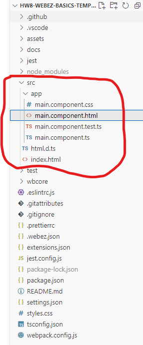
main.component.htmlis the HTML file that defines the structure of the component. This is where we put the visual content of your application.main.component.cssis the CSS file that defines the styles for the component. This is how we make things look pretty.main.component.tsis the TypeScript file that defines theMainComponentclass. This is where the application logic will go.main.component.test.tsis a (mostly empty) test file for the component. We’ll talk more about testing your own components later on.
- Open
main.component.html. You will see that it contains the following code:
<div>
    <div class="header">
        <div class="title">hw8-webz-basics Example</div>
    </div>
</div>
This is the default content that comes with the starter repo. The div tag is a generic container that can hold other elements (a “division” of content). In this case, we have a div with the class header, which contains a div with the class title. The class attribute is used to apply CSS styles to the element. We’ll talk more about CSS later on. For now, focus on the text inside of the div tags.
- Change the text inside the
divwith the classtitleto something else. For example, you could change it to:
<div class="title">My First Webz Application</div>
-
Save the file. You should see the changes reflected in the browser window automatically. If you don’t see the changes, make sure that the debug mode is still running.
-
Now, let’s add a new element to the page with some more text. Add the following code after the
divwith the classheader, but inside the outerdiv. Theptag is used to create a paragraph of text.
<p>Welcome from the HTML side!</p>
If you did this correctly, the HTML should look something like the HTML below. Pay close attention to the structure of your HTML, and make sure you are closing all of your tags properly. The location of tags is important, as it determines how the elements are displayed on the page.
<div>
    <div class="header">
        <div class="title">My First Webz Application</div>
    </div>
    <p>Welcome from the HTML side!</p>
</div>
- Save the file, and confirm that the new text is displayed in the browser window.
- We’re going to modify the
ptag to include anidattribute. This will make it easier to test our application later on. Add theidattribute to theptag, like so:
<p id="example-text">Welcome from the HTML side!</p>
Make sure you use the exact id value (example-text) as shown above. When you save the file, the page will not look any differently. The id attribute is used to uniquely identify an element in the HTML document, but does not affect the appearance of the element.
- Now, let’s add some dynamic text to the page. We’re going to use TypeScript to change the text of a new
ptag. Make a second, emptyptag with anidafter the existing one, like so:
<p id="example-target"></p>
Click here to see the full HTML so far
<div>
    <div class="header">
        <div class="title">My First Webz Application</div>
    </div>
    <p id="example-text">Welcome from the HTML side!</p>
    <p id="example-target"></p>
</div>
IDs Matter!
Make sure you are matching the
idvalues exactly as shown above. This will become important when we run the tests later!
- Open
main.component.ts. This is the TypeScript file that defines theMainComponentclass. This is where the application logic will go. You will see that it contains the following code:
import html from "./main.component.html";
import css from "./main.component.css";
import { WebzComponent } from '@boots-edu/webz';

/**
 * @description MainComponent is the main component of the app
 * @extends WebzComponent
 *
 */
export class MainComponent extends WebzComponent {
    constructor() {
        super(html, css);
    }
}
In Webz, components are defined as classes that extend the WebzComponent class. The MainComponent class is the main component of the application, and it is the component that is displayed on the page. The constructor method is called when an instance of the class is created. In this case, we are calling the super method with the html and css variables. This is how we tell Webz to use the HTML and CSS files that we created. The html and css variables are just strings that contain the contents of the HTML and CSS files, imported from the files themselves.
- Add a new private
stringfield to theMainComponentclass calledmyText, with the initial value"Hello from the TypeScript side!". This field will hold the text that we want to display on the page.
private myText: string = "Hello from the TypeScript side!";
- On its own, just creating a field doesn’t do anything interesting. We need to bind the field to the HTML so that the text is displayed on the page. We can do this by using the
BindValuedecorator. Add the following code directly above themyTextfield:
@BindValue("example-target")
The @BindValue decorator is used to bind a field to an element in the HTML; in general, a decorator can enhance the functionality of a field or a method of a class. This decorator takes a single argument, which is the id of the element that we want to bind to. In this case, we are binding the myText field to the element with the id example-target.
- In order to use the decorator, we must also import the
BindValuedecorator from the@boots-edu/webzpackage. Modify the existing import statement at the top of the file to include theBindValuedecorator:
import { WebzComponent, BindValue } from '@boots-edu/webz';
- If you save the file now, you should be able to see the changes in the live webpage. The text
"Hello from the TypeScript side!"should be displayed on the page. This is because themyTextfield is bound to theexample-targetelement in the HTML. When the field changes, the text on the page will automatically update.
Click here to see the full TypeScript file so far
import html from "./main.component.html";
import css from "./main.component.css";
import { WebzComponent, BindValue } from '@boots-edu/webz';

export class MainComponent extends WebzComponent {

    @BindValue("example-target")
    private myText: string = "Hello from the TypeScript side!";

    constructor() {
        super(html, css);
    }
}
- To test if your website is working correctly, you can run the tests that are included with the starter repo. To do this, open a second terminal (click
Terminalin the top menu, and then chooseNew Terminal) in VS Code and run the following command:
npm run test main
This will run the main.test.ts file that is included with the starter repo. If everything is working correctly, you should see a message that says All tests passed!. If you see any errors, double-check your code to make sure everything is correct.
2) Boop Button Component
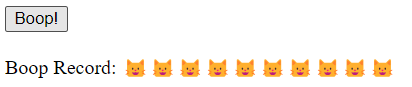
Now we’ll create a second component that lives in the MainComponent. This component will have a button that, when clicked, will add a bit of text to the screen. We’ll use this to demonstrate how to handle events in Webz. We will call this component the “Boop Button”, since our example will be about booping cat’s noses. In the image below, every time the button is clicked, another cat head (“🐱”) will be added to the record.
- Begin by creating the new Boop Button component. This requires running a terminal command from within the
src/appdirectory. Navigate to the terminal in VS Code and run the following commands:
cd src/app/
webz c boop-button
Click here to see the expected output for this command
webz v.0.4.11 is starting...
Creating a new component: boop-button
Copying scaffold files
Component scaffold created
Finished
Error: Webz Is Not Installed
If you get an error that says
webz: command not foundorThe term webz is not recognized, you need to install Webz globally. You can do this by runningnpm install -g @boots-edu/webz-cliin the terminal.If you are on a Mac, you may need to use
sudo npm install -g @boots-edu/webz-cliinstead. You may need to input your password to install the package.If you are using PowerShell for Windows, you might get an error that says
running scripts is disabled on this system. At the top right of your terminal in VS Code, there should be a little+button with a dropdown next to it (looks likev). If you click the dropdown, selectCommand Prompt, and that may allow you to run the command instead.
The c in the command is short for component, and boop-button is the name of the new component. This will create a new folder in the src/app directory with the necessary files for the new component. That folder will have the following files: boop-button.component.ts, boop-button.component.html, boop-button.component.css, and boop-button.component.test.ts.
- The component has been created, but it is not yet being used in the
MainComponent. Openmain.component.tsand add the following import statement at the top of the file:
import { BoopButtonComponent } from './boop-button/boop-button.component';
This imports the BoopButtonComponent class from the boop-button.component.ts file. We will use this class to create an instance of the Boop Button component in the MainComponent.
- Define a new private field in the
MainComponentclass calledboopButtonof typeBoopButtonComponent. This field will hold an instance of the Boop Button component that should be created when theMainComponentis instantiated.
private boopButton: BoopButtonComponent = new BoopButtonComponent();
- Although the
MainComponentclass now has aboopButtonfield, it is not yet being displayed on the page. To do this, we need to add the HTML for the Boop Button component to themain.component.htmlfile. Openmain.component.htmland add the following line after theptags, but before the final</div>:
<div id="boop-button"></div>
Click here to see the main.component.html file so far
<div>
    <div class="header">
        <div class="title">My First Webz Application</div>
    </div>
    <p id="example-text">Welcome from the HTML side!</p>
    <p id="example-target"></p>
    <div id="boop-button"></div>
</div>
- Next, we have to actually add the component instance from the private field to the content of the
MainComponent. Openmain.component.tsand add the following line to theconstructormethod, after the call tosuper:
this.addComponent(this.boopButton, "boop-button");
This takes the component stored in the boopButton field and adds it to the MainComponent’s content. The second argument is the id of the element in the HTML that the component should be added to. In this case, we are adding the Boop Button component to the element with the id boop-button. This allows us to place the Boop Button component in the correct location in the HTML; if we didn’t specify an id, the component would just be added to the end.
Click here to see the full main.component.ts file so far
import html from "./main.component.html";
import css from "./main.component.css";
import { WebzComponent, BindValue } from '@boots-edu/webz';
import { BoopButtonComponent } from './boop-button/boop-button.component';

export class MainComponent extends WebzComponent {

    @BindValue("example-target")
    private myText: string = "Hello from the TypeScript side!";

    private boopButton: BoopButtonComponent = new BoopButtonComponent();

    constructor() {
        super(html, css);
        this.addComponent(this.boopButton, "boop-button");
    }
}
- When you save these files, the Boop Button component should now be displayed on the page. However, there is not yet any button or functionality in the Boop Button component, just the default text that comes from creating a new component. Open the
boop-button/boop-button.component.htmlfile and replace the existing content with the following code:
<div>
    <button id="booper">Boop!</button>
    <p>Boop Record: <span id="boops"></span></p>
</div>
This HTML creates a button with the text “Boop!” and a paragraph that displays the boop record, with a span tag holding the actual boops data. A span tag is meant to hold a short, inline snippet of text (inside of a paragraph tag or div). The boops span is initially empty, but it will be updated every time the button is clicked. We have also added an id attribute to the button (booper) and the span element (boops), which we will use to bind the button click event and the boop record text. Make sure you get the names of the id attributes exactly right, as they will be used in the TypeScript code to bind the elements.
- Now, we need to add some functionality to the Boop Button component. Open the
boop-button/boop-button.component.tsfile and add a new privatestringfield namedboopsto theBoopButtonComponentclass, initially an empty string. You also need to import theBindValuedecorator from the@boots-edu/webzpackage to bind theboopsfield to thespanwith the sameidin the HTML.
import { WebzComponent, BindValue } from '@boots-edu/webz';
import html from "./boop-button.component.html";
import css from "./boop-button.component.css";

export class BoopButtonComponent extends WebzComponent {

    @BindValue("boops")
    private boops: string = "";

    constructor() {
        super(html, css);
    }
}
- When clicked, the button will not do anything yet, because we have not added any event handling to the Boop Button component. We need to add an event handler to the button that will update the
boopsfield every time the button is clicked. To do this, we need to add a new method to theBoopButtonComponentclass that will be called when the button is clicked. We will decorate that button with a specialClickdecorator (which must be imported from@boots-edu/webz. Add the following method to theBoopButtonComponentclass:
@Click("booper")
private boop() {
    this.boops += "🐱";
}
Choose Your Own Emoji
You are free to replace the cat head emoji with any other character or text you like; the tests are flexible.
The @Click decorator is used to bind a method to an event on an element. In this case, we are binding the boop method to the Click event on the button with the id booper. This means that every time the button is clicked, the boop method will be called. The boop method appends a cat head emoji to the boops field.
Click here to see the full boop-button.component.ts file so far
import { BindValue, Click, WebzComponent } from "@boots-edu/webz";
import html from "./boop-button.component.html";
import css from "./boop-button.component.css";

export class BoopButtonComponent extends WebzComponent {
    @BindValue("boops")
    private boops: string = "";

    constructor() {
        super(html, css);
    }

    @Click("booper")
    boop() {
        this.boops += "🐱";
    }
}
-
Save the files and check the live webpage. You should see the Boop Button component with a button that says “Boop!” and a paragraph that displays the boop record. Every time you click the button, a new cat head emoji should be added to the boop record. This demonstrates how to handle events in Webz.
-
To test if your website is working correctly, you can run the tests that are included with the starter repo. To do this, open a terminal in VS Code and run the following command:
npm run test boop
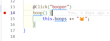
- This is a good time to try out the debugger in VS Code. You can set a breakpoint in the
boopmethod in theBoopButtonComponentclass to see the current values of the variables. To do this, click on the left margin of the editor window next to the line of code where you want to set the breakpoint. A red dot will appear, indicating that a breakpoint has been set. When you click the button on the live webpage, the code will pause at the breakpoint, and you can inspect the values of the variables. Set a breakpoint next to theboopmethod as shown below:
Click the Boop button, and execution will pause inside of the boop method!
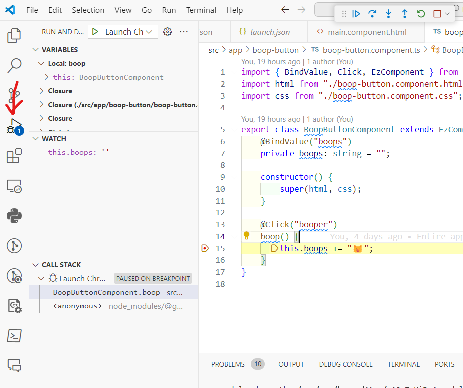
The left pane will be the debugger, accessible via the Debug tab in the sidebar (the bug on top of a triangle icon).
- The top box is the variables in the current scope (and any enclosing scopes - don’t worry about those just yet, though you’re free to poke around if you are curious).
- The middle box is the “Watch” box, where we can add specific variables and expressions to watch (we’ve added the
this.boopsexpression to monitor). - The bottom box is the call stack, which shows the current function calls that have led to the current point in the code.
There is a small bar in the topright of the screenshot (probably in the top center of your screen) with controls for stepping through the code. From left to right, they are:
- Continue (play button): Continue running the code until the next breakpoint.
- Step Over (arrow pointing right): Run the next line of code.
- Step Into (arrow pointing down): If the next line of code is a function call, step into the function.
- Step Out (arrow pointing up): Finish running the current function and return to the calling function.
- Restart (circular arrow): Restart the debugger from the beginning.
- Stop (square): Stop the debugger.
Click the Step Over button to run the next line of code.
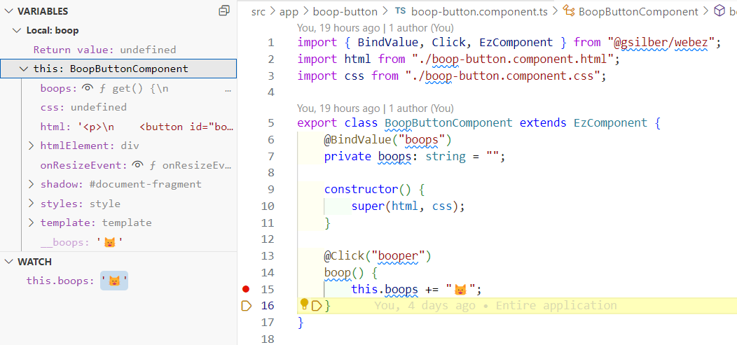
If you expand the this object in the variables pane, you can see the current value of the boops field. The output may look a little confusing, saying something like f get() {\n - this is a quirk of how Webz-decorated fields look in the debugger. To see the value properly, you must click the little eyeball symbol next to the field name.
To make things a little easier, you can also add the this.boops expression to the Watch box to monitor the value of the boops field as you step through the code. Hover over the WATCH box and click the + button to add a new watch expression. Type this.boops into the box and press Enter. You should see the current value of the boops field displayed in the Watch box.
Hover Over Variables
You can also hover over variables in the code to see their current values, while you are stepping through code. There are many other little features in the debugger that can be very helpful, so feel free to explore!
3) Simple Calculator Component
Our next component will be a simple calculator. This calculator will have two input fields for numbers, a select box for the operation, and a button to calculate the result. The result will be displayed on the page. We will use this component to demonstrate how to bind values to input fields and select boxes, and how to handle their associated events in Webz.

- Begin by creating the new Simple Calculator component. Once again, this requires running a terminal command from within the
src/appdirectory. Navigate to the terminal in VS Code. Most likely, you are already in thesrc/appdirectory, but if not, runcd src/app/and then run the following commands:
webz c simple-calculator
Just like last time, this will create a new folder in the src/app directory with the necessary files for the new component. The folder will have the following files: simple-calculator.component.ts, simple-calculator.component.html, simple-calculator.component.css, and simple-calculator.component.test.ts.
- As before, we have to import the new component into the
MainComponent, create an instance of the component, and add it to the content of theMainComponent. Openmain.component.ts, import theSimpleCalculatorComponentclass, and add a new private field to theMainComponentclass calledcalculatorof typeSimpleCalculatorComponent. Then, add the component to the content of theMainComponentin theconstructormethod.
Click here to see what the main.component.ts file should look like when you have done this!
import html from "./main.component.html";
import css from "./main.component.css";
import { BindValue, WebzComponent } from "@boots-edu/webz";
import { BoopButtonComponent } from "./boop-button/boop-button.component";
import { SimpleCalculatorComponent } from "./simple-calculator/simple-calculator.component";

/**
 * @description MainComponent is the main component of the app
 * @extends WebzComponent
 *
 */
export class MainComponent extends WebzComponent {
    @BindValue("example-target")
    private myText: string = "Hello from the TypeScript side!";

    private boopButton = new BoopButtonComponent();
    private calculator = new SimpleCalculatorComponent();

    constructor() {
        super(html, css);
        this.addComponent(this.boopButton, "boop-button");
        this.addComponent(this.calculator, "calculator");
    }
}
- Similarly, you must also add in a new
divelement with theidcalculatorto themain.component.htmlfile. This will be the location where the Simple Calculator component will be displayed on the page. Openmain.component.htmland add the following line after theboop-buttondiv, but before the final</div>:
<div id="calculator"></div>
Click here to see the main.component.html file when you have done this correctly.
<div>
    <div class="header">
        <div class="title">My first application!</div>
    </div>
    <p id="example-text">Welcome from the HTML side!</p>
    <p id="example-target"></p>
    <div id="boop-button"></div>
    <div id="calculator"></div>
</div>
- Once those files are saved, we can see the Simple Calculator component on the live webpage, although it will still just have the default content that comes from creating a new component. Open the
simple-calculator/simple-calculator.component.htmlfile and replace the existing content with the following code:
<div>
    <input type="number" id="first-number" />
    <input type="number" id="second-number" />

    <select id="operation-select">
        <option value="add">Add</option>
        <option value="subtract">Subtract</option>
        <option value="multiply">Multiply</option>
        <option value="divide">Divide</option>
    </select>

    <button id="calculate-button">Calculate</button>

    <span id="result"></span>
</div>
Let’s break down all the new elements in the Simple Calculator component:
- The first element is an
inputtag with thetypeattribute set tonumberand anidattribute set tofirst-number. This is where the user will input the first number for the calculation. Thetypeattribute specifies the type of input field; we could have usedtext,password, or other types as well. - The second element is another
inputtag, with similar settings, but with anidattribute set tosecond-number. This is where the user will input the second number for the calculation. - The third element is a
selecttag with theidattribute set tooperation-select. This is a dropdown box that allows the user to select the operation they want to perform. Theoptiontags inside theselecttag represent the different options in the dropdown box. Eachoptiontag has avalueattribute that specifies the actual value of the option when it is selected. The text inside theoptiontag is what is displayed to the user. - The fourth element is a
buttontag with theidattribute set tocalculate-button. This is the button that the user will click to perform the calculation. The text inside thebuttontag is what is displayed on the button. - The fifth element is a
spantag with theidattribute set toresult. This is where the result of the calculation will be displayed.
- Next, we need to add some TypeScript functionality to the Simple Calculator component. Open the
simple-calculator/simple-calculator.component.tsfile and add a new private field to theSimpleCalculatorComponentclass calledfirstNumberof typenumber, initially set to7. You also need to import theBindValueToNumberdecorator from the@boots-edu/webzpackage to bind theresultfield to thespanwith the sameidin the HTML. Note that we are usingBindValueToNumberinstead ofBindValuebecause the input fields are of typenumber!
import { BindValueToNumber, WebzComponent } from "@boots-edu/webz";
import html from "./simple-calculator.component.html";
import css from "./simple-calculator.component.css";

export class SimpleCalculatorComponent extends WebzComponent {
    @BindValueToNumber("first-number")
    private firstNumber: number = 7;

    constructor() {
        super(html, css);
    }
}
When saved, the firstNumber field should be bound to the first-number input field in the HTML. This means that the value of the firstNumber field will be displayed in the input field. However, this is a one-way binding; if the user changes the value in the input field, the firstNumber field will not be updated. We will add that functionality next.
- We need to add a new method to the
SimpleCalculatorComponentclass that will be called every time the value in thefirst-numberinput field changes. We will decorate this method with a specialInputdecorator (which must be imported from@boots-edu/webz, along with another class namedValueEvent). Add the following method to theSimpleCalculatorComponentclass:
@Input("first-number")
onFirstNumberChange(event: ValueEvent) {
    this.firstNumber = +event.value;
}
Where to Place?
Put this method in the
SimpleCalculatorComponentclass, fully after the constructor. In general, we recommend putting the fields before the constructor, and the methods after the constructor.
The @Input decorator is used to bind a method to an “Input” event on an input element. In this case, we are binding the onFirstNumberChange method to the Input event on the input field with the id first-number. This means that every time the value in the input field changes, the onFirstNumberChange method will be called. The onFirstNumberChange method takes an event parameter of type ValueEvent, which contains the new value of the input field. The + operator is used to convert the value to a number, since the value is always a string. As long as the user inputs a valid number, this will work correctly.
- Now we need to do the same thing for the
second-numberinput field. Add a new private field to theSimpleCalculatorComponentclass calledsecondNumberof typenumber, initially set to3. Then, add a new method to theSimpleCalculatorComponentclass that will be called every time the value in thesecond-numberinput field changes. As before, we will decorate this method with a specialInputdecorator. Add the following code to theSimpleCalculatorComponentclass:
@BindValueToNumber("second-number")
private secondNumber: number = 3;

// ...constructor...

@Input("second-number")
onSecondNumberChange(event: ValueEvent) {
    this.secondNumber = +event.value;
}
- Next, we need to add a new private field to the
SimpleCalculatorComponentclass calledoperationSelectof typestring, initially set to"add". This field will hold the value of the selected operation from the dropdown box. We also need to import theBindValuedecorator from the@boots-edu/webzpackage to bind theoperationSelectfield to theselectbox with the sameidin the HTML.
import { BindValue, BindValueToNumber, WebzComponent, Input, ValueEvent } from "@boots-edu/webz";
// ...other imports...

export class SimpleCalculatorComponent extends WebzComponent {
    // ...other fields...

    @BindValue("operation-select")
    private operationSelect: string = "add";

    // ...other methods...
}
- We need to add a new method to the
SimpleCalculatorComponentclass that will be called every time the value in theoperation-selectselect box changes. We will decorate this method with a specialChangedecorator (which must, as always, be imported!). Add the following method to theSimpleCalculatorComponentclass:
@Change("operation-select")
onOperationChange(event: ValueEvent) {
    this.operationSelect = event.value;
}
The @Change decorator is used to bind a method to a “Change” event on a select element. In this case, we are binding the onOperationChange method to the Change event on the select box with the id operation-select. The event parameter is once again a ValueEvent, which contains the new value of the select box. This value is then stored in the operationSelect field directly, without needing to convert it to a number.
- We need to add a new private field to the
SimpleCalculatorComponentclass calledresultof typenumber, initially set to0. This field will hold the result of the calculation. This field will be bound to theresultspan in the HTML.
@BindValueToNumber("result")
private result: number = 0;
- Finally, we need to add a new method to the
SimpleCalculatorComponentclass that will be called every time the button is clicked. We will decorate this method with theClickdecorator. Add the following method to theSimpleCalculatorComponentclass:
@Click("calculate-button")
calculate() {
    const firstNumber = this.firstNumber;
    const secondNumber = this.secondNumber;
    let result = 0;

    // Do the math
    result = firstNumber + secondNumber;

    this.result = result;
}
The calculate method gets the values of the firstNumber and secondNumber fields, performs the calculation based on the selected operation, and stores the result in the result field. In this case, we are only performing addition, so you will need to modify this method to handle the other operations as well. Add an if statement to check the value of the this.operationSelect field and perform the appropriate calculation based on the selected operation.
Click here to see the full simple-calculator.component.ts file when this is done correctly.
import { BindValue, BindValueToNumber, Change, Click, WebzComponent, Input, ValueEvent } from "@boots-edu/webz";
import html from "./simple-calculator.component.html";
import css from "./simple-calculator.component.css";

export class SimpleCalculatorComponent extends WebzComponent {
    @BindValueToNumber("first-number")
    firstNumber: number = 7;
    @BindValueToNumber("second-number")
    secondNumber: number = 3;

    @BindValue("operation-select")
    operationSelect: string = "multiply";

    @BindValueToNumber("result")
    result: number = 0;

    constructor() {
        super(html, css);
    }

    @Input("first-number")
    onFirstNumberChange(evt: ValueEvent) {
        this.firstNumber = +evt.value;
    }

    @Input("second-number")
    onSecondNumberChange(evt: ValueEvent) {
        this.secondNumber = +evt.value;
    }

    @Change("operation-select")
    onOperationSelectChange(event: ValueEvent) {
        this.operationSelect = event.value;
    }

    @Click("calculate-button")
    calculate() {
        const firstNumber = this.firstNumber;
        const secondNumber = this.secondNumber;
        let result = 0;

        if (this.operationSelect === "add") {
            result = firstNumber + secondNumber;
        } else if (this.operationSelect === "subtract") {
            result = firstNumber - secondNumber;
        } else if (this.operationSelect === "multiply") {
            result = firstNumber * secondNumber;
        } else if (this.operationSelect === "divide") {
            result = firstNumber / secondNumber;
        }

        this.result = result;
    }
}
-
Save the files and check the live webpage. You should see the Simple Calculator component with two input fields for numbers, a dropdown box for the operation, a button to calculate the result, and a span to display the result. You can input numbers into the input fields, select an operation from the dropdown box, and click the button to perform the calculation. The result should be displayed in the span.
-
Run the tests for the Simple Calculator component to make sure everything is working correctly. Open a terminal in VS Code and run the following command:
npm run test calculator
Save, Commit, and Push
If you haven’t saved, committed, and pushed recently, you should probably do so now. This will ensure that your changes are saved and backed up on Github.
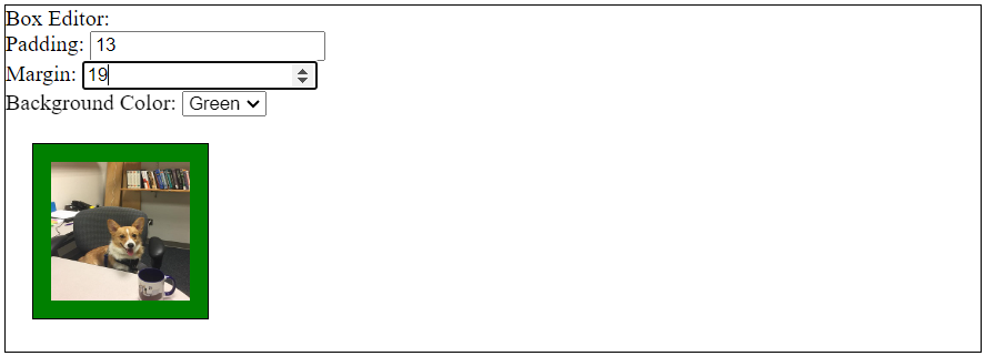
4) Box Editor Component
Our final component will be a Box Editor component. This component will allow the user to create a box around an image with a specified padding, margin, and background color. The user will be able to input these values into input fields and select boxes, and the box will be displayed on the page. We will use this component to demonstrate how to bind values to style properties, and show a little bit about the CSS “Box Model”.
- Begin by creating the new Box Editor component. Once again, this requires running a terminal command from within the
src/appdirectory. Navigate to the terminal in VS Code. Most likely, you are already in thesrc/appdirectory, but if not, runcd src/app/and then run the following commands:
webz c box-editor
Just like last time, this will create a new folder in the src/app directory with the necessary files for the new component.
-
As before, we have to import the new component into the
MainComponent, create an instance of the component, and add it to the content of theMainComponent. Openmain.component.ts, import theBoxEditorComponentclass, and add a new private field to theMainComponentclass calledboxof typeBoxEditorComponent. Then, add the component to the content of theMainComponentin theconstructormethod to a target id"box". -
Edit the
main.component.htmlfile to include a newdivelement with theidbox, just like we did for the other components. -
With the component added to the content of the
MainComponent, we can see the Box Editor component on the live webpage. However, it will still just have the default content that comes from creating a new component. Open thebox-editor/box-editor.component.htmlfile and replace the existing content with the following code:
<div class="frame">
    Box Editor:
    <div>
        <label for="padding-input">Padding: </label>
        <input type="number" id="padding-input" />
        <br />
        <label for="margin-input">Margin: </label>
        <input type="number" id="margin-input" />
        <br />
        <label for="background-select">Background Color: </label>
        <select id="background-select">
            <option value="red">Red</option>
            <option value="green">Green</option>
            <option value="blue">Blue</option>
        </select>
        <br />
        <img src="___" id="image" class="frame" />
    </div>
</div>
There’s a lot of new stuff in this HTML, so let’s break it down:
- The first element is a
divtag with the classframe. This is the outer frame of the box that will be created around the box editor, and we are going to make it explicitly visible by adding some CSS styling to it. To do so, we have to attach the classframeto thedivtag. More on that soon. - Inside the inner
divtag, we have threelabeltags, each with aforattribute that corresponds to theidof an input field or select box. This is a best practice for accessibility, as it allows screen readers to associate the label with the input field. It also makes it easier to use in general, since clicking on the label will focus the input field. - The first
labeltag is for the padding input field, which is aninputtag with thetypeattribute set tonumberand anidattribute set topadding-input. This is where the user will input the padding value for the box. The padding is the space around the image inside the box. - The second
labeltag is for the margin input field, which is similar to the padding input field, but with anidattribute set tomargin-input. This is where the user will input the margin value for the box. The margin is the space around the box itself, to keep it away from other HTML elements. - The third
labeltag is for the background color select box, which is aselecttag with theidattribute set tobackground-select. This is a dropdown box that allows the user to select the background color of the box. Theoptiontags inside theselecttag represent the different options in the dropdown box. Eachoptiontag has avalueattribute that specifies the actual value of the option when it is selected. The text inside theoptiontag is what is displayed to the user. - The
brtags are used to create line breaks between the input fields and select box, to make the form easier to read. - Finally, the
imgtag is used to display an image inside the box. Thesrcattribute is set to___, which is a placeholder for the actual image URL. Theidattribute is set toimage, and theclassattribute is set toframe. Theclassattribute is used to attach theframeclass to the image, which will make it visible inside the box.
- We need to choose an image to display inside the box. You can use any image you like, although we recommend one that is not too large. We used a picture of our dog Ada. Save the image to the
assetsdirectory and replace the___in theimgtag with the name of the image file. For example, if the image is namedada.jpg, theimgtag should look like this:
<img src="assets/ada.jpg" id="image" class="frame" />
The src Matters
The
srcattribute of theimgtag should point to the correct location of the image file. If the image is not displayed, double-check the path to the image file. Make sure you put the file in theassetsdirectory and that the path in thesrcattribute is correct, and does not have unnecessary slashes (/). Also double check that you have the right file extension (.jpg,.png, etc.).
- Before we add the TypeScript functionality to the Box Editor component, we need to add some CSS styling to make the box frame visible. Open the
box-editor/box-editor.component.cssfile and add the following CSS code:
#image {
    width: 100px;
    height: 100px;
}

.frame {
    border: 1px solid black;
}
This is the first CSS we’ve written, so let’s break it down:
- The
#imageselector is used to style the image inside the box. By using a#symbol, we can explicitly refer to a specific id on the page. Then, inside of the curly braces, we can set rules by writingkey: value;pairs. In this case, we are setting thewidthandheightof the image to100px. You can adjust these values to make the image larger or smaller, depending on your preference. - The
.frameselector is used to style the outer frame of the box. By using a.symbol, we can refer to any occurrence of aclasson the page (as specified by theclassattribute). In this case, we are setting theborderof the frame to1px solid black. This will create a thin black border around the box. You can adjust the1pxvalue to make the border thicker or thinner, and you can change theblackvalue to any other color you like.
CSS is very powerful and allows you to style the page in a lot of different ways. That is all the CSS class styling we will do, but next we will add the TypeScript functionality that will affect the styling of the box dynamically.
-
Open the
box-editor/box-editor.component.tsfile and add a new private field to theBoxEditorComponentclass calledpaddingof typenumber, initially set to0. You also need to import theBindValueToNumberdecorator from the@boots-edu/webzpackage to bind thepaddingfield to thepadding-inputinput field in the HTML. You then also need to create a new method (onPaddingChange) to handle theInputevent on thepadding-inputinput field. Refer to the code you used in the Simple Calculator component to help you with this. -
Repeat this for the
margininput field. Add a new private field to theBoxEditorComponentclass calledmarginof typenumber, initially set to0. Bind themarginfield to themargin-inputinput field in the HTML. Create a new method (onMarginChange) to handle theInputevent on themargin-inputinput field. -
Just changing the padding and margin values won’t be enough to see the changes on the page. We need to bind the padding and margin values to the actual CSS properties of the box frame. To do this, we need to use a special
BindStyleToNumberAppendPxdecorator that will bind the padding and margin values to thepaddingandmarginCSS properties of the image (these style attributes are measured in pixels, so the decorator appends"px"to the numbers automatically). Add the following code to theBoxEditorComponentfields:
@BindStyleToNumberAppendPx("image", "padding")
@BindValueToNumber("padding-input")
private padding: number = 0;

@BindStyleToNumberAppendPx("image", "margin")
@BindValueToNumber("margin-input")
private margin: number = 0;
Now you should be able to change the padding and margin values in the input fields, and see the changes reflected in the box frame on the page. Try making the padding and margin values larger or smaller to see how it affects the box.
-
Next, we need to add a new private field to the
BoxEditorComponentclass calledbackgroundof typestring, initially set to"red". You also need to import theBindValuedecorator from the@boots-edu/webzpackage to bind thebackgroundfield to thebackground-selectselect box in the HTML. Create a new method (onBackgroundChange) to handle theChangeevent on thebackground-selectselect box. -
To make the background color change whenever we change the
backgroundfield, we need to bind thebackgroundfield to thebackground-colorCSS property of the image. To do this, we need to use a specialBindStyledecorator that will bind thebackgroundfield to thebackgroundColorCSS property of the image. Add the following code to theBoxEditorComponentfields:
@BindStyle("image", "backgroundColor")
@BindValue("background-select")
background: string = "red";
The
backgroundColorPropertyThe CSS property is actually called
background-color, but Webz refers to it asbackgroundColorto match the TypeScript naming style. This is a common convention in JavaScript and TypeScript, where hyphens from the CSS/HTML side are replaced with camelCase.
Click here to see the full box-editor.component.ts file when this is done correctly.
import {
    BindStyle,
    BindStyleToNumberAppendPx,
    BindValue,
    BindValueToNumber,
    Change,
    WebzComponent,
    Input,
    ValueEvent,
} from "@boots-edu/webz";
import html from "./box-editor.component.html";
import css from "./box-editor.component.css";

export class BoxEditorComponent extends WebzComponent {
    @BindStyleToNumberAppendPx("image", "padding")
    @BindValueToNumber("padding-input")
    padding: number = 0;

    @BindStyleToNumberAppendPx("image", "margin")
    @BindValueToNumber("margin-input")
    margin: number = 0;

    @BindStyle("image", "backgroundColor")
    @BindValue("background-select")
    background: string = "red";

    constructor() {
        super(html, css);
    }

    @Input("padding-input")
    onPaddingChange(v: ValueEvent) {
        this.padding = +v.value;
    }
    @Input("margin-input")
    onMarginChange(v: ValueEvent) {
        this.margin = +v.value;
    }

    @Change("background-select")
    onBackgroundChange(v: ValueEvent) {
        this.background = v.value;
    }
}
- Save the files and check the live webpage. You should see the Box Editor component with input fields for padding and margin, a select box for the background color, and an image inside a box frame. You can input values into the input fields, select a background color from the dropdown box, and see the changes reflected in the box frame on the page.
You should also now run the tests for the Box Editor component to make sure everything is working correctly:
npm run test box
We have only begun to scratch the surface of what we can do with Webz:
- There are many other CSS properties we can manipulate, like borders, shadows, and animations.
- We can bind to other types of events, including Timers.
- We can create more complex components with multiple elements and interactions.
- We can use other HTML Elements and CSS properties to create more complex layouts and designs.
5) Deploy Your Site
For now, this is a good place to stop. You have learned how to create components, bind values to elements, handle events, and style elements with Webz. You have also learned how to use TypeScript and CSS to create dynamic and interactive web pages. You can now build on this knowledge to create more complex and interesting web applications. But before we finish, let’s deploy your site!
- In order to let you build your site locally (despite the tests originally failing), we modified one of the build files a little bit. To deploy your site, you need to revert this change. Open the
tsconfig.jsonfile in the top-level of your project folder, and change line 13 to become:
"include": ["./src/**/*", "./wbcore/**/*", "./jest/**/*", "./test/**/*"],
Editing Build Files
We won’t normally ask you to edit your build files; this is a special case just to make it easier to get started on the assignment.
-
Make sure you save all the files, commit your changes, and push them to Github.
-
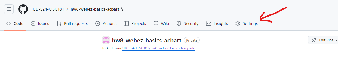
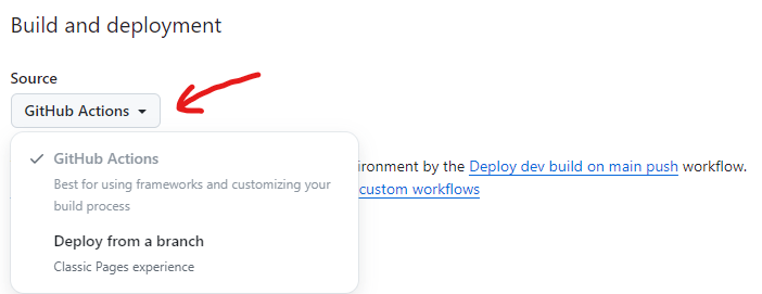
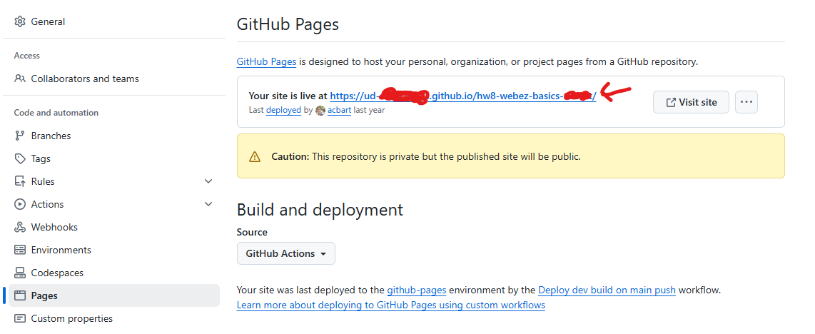
Next, you need to enable Github Pages for your repository. Go to the repository on Github, click on the “Settings” tab.
- Scroll down to the “Github Pages” section.
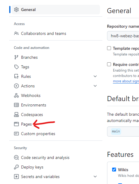
- In the Source dropdown, select “GitHub Actions”.
- Go to the Actions tab and you should see a “workflow” running. This workflow will build and deploy your site to Github Pages. Once the workflow is complete, you should see a link to your site at the top of the page.
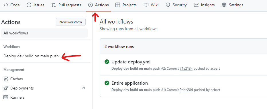
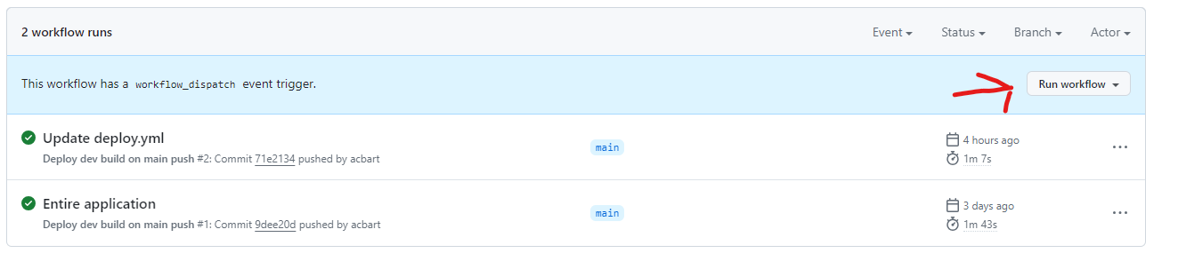
If the workflow doesn’t seem to be running, click “Deploy dev build on main push” (or whatever phrasing is given under Workflow) and then click “Run workflow”. This will manually trigger the workflow to run, although you may have to reload the page to see it.
You can check the progress of a workflow by clicking on it:

Click on the “deploy” button on the left sidebar to see the details of the deployment.
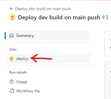
Assuming nothing goes wrong during deployment, you should see checkmarks next to all the steps.
You can find the URL of your live site by going back to the “Settings” tab and scrolling down to the “Github Pages” section. The URL should be displayed there.
6) Submission
Once you have completed the tutorial and deployed your site, you can submit on GradeScope. If you have any questions or issues, please don’t hesitate to ask for help!
In addition to passing our tests, you will also be graded on the successful deployment of your site. If the site is not deployed, you will not receive credit for the assignment. The TAs and instructors will review your site, your tests, and your code to ensure that you have completed the assignment correctly.
Next Step
Next we’ll learn more advanced features of Webz and how to use them Advanced Webz »