Webz Advanced Tutorial
Table of contents
Key Idea
Notifier is a powerful class for facilitating inter-component data transfer in Webz.
This tutorial will walk you through building a more complex Webz application with multiple components and dynamic content. This will involve creating a new component, binding data between components, and handling events. By the end of this tutorial, you will have a better understanding of how to build more complex applications with Webz.
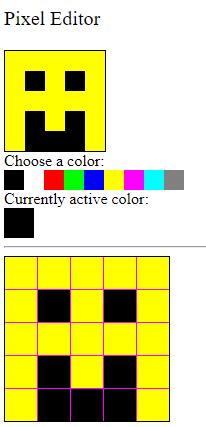
The Image Editor
Our goal is to create a simple image editor to edit pixel art. We will create a component that displays an image and allows the user to edit the image by changing the color of individual pixels. We will also create a color picker component that allows the user to select a color to use for editing the image.
0) Setup
- Use the Github classroom link provided in the original assignment on Canvas to create your own copy of the starter repo.
- Clone the repo to your local machine in an appropriate directory.
- Open the directory in VS Code, as you normally do.
- Run
npm installin the VS Code terminal to install the dependencies.
npm install
- Run
npm run startin the terminal to start the development server. This may take a few seconds to compile the code and start the server. If you need to stop the server, you can pressCtrl+Cin the terminal.
You can click here to see what the output looks like for us when the server starts successfully.
Keep in mind that the details of your output may look different!
> hw9-webz-advanced@0.0.1 start
> webpack serve

<i> [webpack-dev-server] Project is running at:
<i> [webpack-dev-server] Loopback: http://localhost:8080/
<i> [webpack-dev-server] On Your Network (IPv4): http://10.0.0.154:8080/
<i> [webpack-dev-server] On Your Network (IPv6): http://[fe80::33d:1bcd:53b8:4c62]:8080/
<i> [webpack-dev-server] Content not from webpack is served from 'C:\Users\acbar\Projects\cisc181\sites\hw9-webz-advanced\public' directory
<i> [webpack-dev-server] 404s will fallback to '/index.html'
assets by path assets/ 110 KiB
  asset assets/babbage.jpg 63.8 KiB [emitted] [from: assets/babbage.jpg] [copied]
  asset assets/ada.jpg 45.9 KiB [emitted] [from: assets/ada.jpg] [copied]
  asset assets/.keep 0 bytes [emitted] [from: assets/.keep] [copied]
asset main.bundle.js 367 KiB [emitted] (name: main) 1 related asset
asset index.html 198 bytes [emitted]
runtime modules 27.4 KiB 13 modules
modules by path ./node_modules/ 219 KiB 41 modules
modules by path ./src/app/ 38.9 KiB
  modules by path ./src/app/boop-button/ 7.3 KiB 4 modules
  modules by path ./src/app/simple-calculator/ 12.2 KiB 4 modules
  modules by path ./src/app/box-editor/ 10.7 KiB 4 modules
  modules by path ./src/app/*.css 3.02 KiB 2 modules
  ./src/app/main.component.ts 5.21 KiB [built] [code generated]
  ./src/app/main.component.html 445 bytes [built] [code generated]
modules by path ./*.css 3.5 KiB
  ./styles.css 2.23 KiB [built] [code generated]
  ./node_modules/css-loader/dist/cjs.js!./styles.css 1.27 KiB [built] [code generated]
./wbcore/start.ts 265 bytes [built] [code generated]
webpack 5.91.0 compiled successfully in 4226 ms
- Although we could now open your website in chrome at the localhost url
http://localhost:8080, we will use the integrated debugger in VS Code. Activate this by pressingF5on your keyboard (or selecting theRuntab from the top menu and then clickingStart Debugging). This will open a new browser window with your application running. The debugger has a bunch of useful features, like setting breakpoints and inspecting variables - we’ll talk more about them later on.
Debugging in VS Code
You can only activate the debugger if you have the server running. If you close the server, you will need to start it again before you can use the debugger.
- You should now be able to see your website. Now we can start making the actual application.
1) Colors
Our goal is to eventually create a simple image editor, but that all begins with a representation of colors. We will create a Color class that represents a color as an RGB value. This will not be a WebzComponent, but a simple TypeScript class. We’ll eventually create other components that use this class.
-
Create a new file in the
src/appdirectory calledcolor.ts. Create and export a class calledColorwith three private properties:red,green, andblue. These properties should be numbers that represent the red, green, and blue values of the color. The constructor should take three parameters, one for each property, in this order. -
Define a method in the class named
toString()that consumes nothing and returns a string. This method should return a string that represents the color in the formatrgb(red, green, blue). For example, if the color hasred=255,green=0, andblue=0, thetoString()method should return the stringrgb(255,0,0). -
Define a method in the class named
asNumbers()that consumes nothing and returns an array of three numbers. This method should return a newly created array with the red, green, and blue values of the color in that order.
Palettes
Colors are usually described as a combination of red, green, and blue values. Each value can range from 0 to 255, where 0 means no color and 255 means the maximum amount of color. For example, rgb(255, 0, 0) is a bright red color, while rgb(0, 255, 0) is a bright green color.
However, writing out three numbers every time we want to represent a color can be cumbersome. Our application will use an additional color representation that is more user-friendly: a palette. A palette is an index of colors (usually an array of colors) that can be used to represent colors in a more user-friendly way. Specifically, we will use a palette of 9 colors (0-8) to represent colors in our image editor:
| Palette Index | Color Triple | Name | Preview |
|---|---|---|---|
| 0 | [0, 0, 0] | Black | |
| 1 | [255, 255, 255] | White | |
| 2 | [255, 0, 0] | Red | |
| 3 | [0, 255, 0] | Green | |
| 4 | [0, 0, 255] | Blue | |
| 5 | [255, 255, 0] | Yellow | |
| 6 | [255, 0, 255] | Magenta | |
| 7 | [0, 255, 255] | Cyan | |
| 8 | [128, 128, 128] | Gray |
This way, an image can be written as a 2D array of palette indices, where each index represents a color in the palette. For example, the following 2D grid represents a 5x5 image of a smiley face (remember that 0 is black and 5 is yellow):
| 5 | 5 | 5 | 5 | 5 |
| 5 | 0 | 5 | 0 | 5 |
| 5 | 5 | 5 | 5 | 5 |
| 5 | 0 | 5 | 0 | 5 |
| 5 | 0 | 0 | 0 | 5 |
This would translate to the following 2D number array in TypeScript:
const smileyFace: number[][] = [
    [5, 5, 5, 5, 5],
    [5, 0, 5, 0, 5],
    [5, 5, 5, 5, 5],
    [5, 0, 5, 0, 5],
    [5, 0, 0, 0, 5]
];
Which is much more compact than the Color[][] representation would be.
const smileyFace: Color[][] = [
    [new Color(255, 255, 0), new Color(255, 255, 0), new Color(255, 255, 0), new Color(255, 255, 0), new Color(255, 255, 0)],
    [new Color(255, 255, 0), new Color(0, 0, 0), new Color(255, 255, 0), new Color(0, 0, 0), new Color(255, 255, 0)],
    [new Color(255, 255, 0), new Color(255, 255, 0), new Color(255, 255, 0), new Color(255, 255, 0), new Color(255, 255, 0)],
    [new Color(255, 255, 0), new Color(0, 0, 0), new Color(255, 255, 0), new Color(0, 0, 0), new Color(255, 255, 0)],
    [new Color(255, 255, 0), new Color(0, 0, 0), new Color(0, 0, 0), new Color(0, 0, 0), new Color(255, 255, 0)]
];
- To make it possible to support palettes, we will need a
PALETTEarray that holds the colors of the palette. This array should be a constant array ofnumber[]triples (arrays of length 3), where each index corresponds to the index of the color in the palette. For example,PALETTE[0]should be black ([0, 0, 0]),PALETTE[1]should be white ([255, 255, 255]), and so on. You will need to export thePALETTEarray so that the test can access it.
export const PALETTE: number[][] = [
    [0, 0, 0], // Black
    [255, 255, 255], // White
    [255, 0, 0], // Red
    [0, 255, 0], // Green
    [0, 0, 255], // Blue
    [255, 255, 0], // Yellow
    [255, 0, 255], // Magenta
    [0, 255, 255], // Cyan
    [128, 128, 128] // Gray
];
-
Create and export a function named
makeColorthat consumes anumberand returns aColor. This function should take a numberindexand return a newColorobject with the red, green, and blue values from thePALETTEarray at the given index. For example,makeColor(0)should return a newColorobject with the red, green, and blue values fromPALETTE[0]. Additionally, if the index is out of bounds, the function should throw an error with an appropriate message (e.g.,"Invalid color index"). -
Finally, create and export a function named
convertPalettethat consumes a 2D number array (representing a palette-indexed image) and returns a 2DColorarray. This function convert each of the palette-indexed numbers to aColorobject using themakeColorfunction. For example,convertPalette(smileyFace)should return a 2D array ofColorobjects that represent the smiley face image.
2D Arrays
Notice that both the
PALETTEand thesmileyFacearrays are 2D arrays (an array of arrays). However, they are different types of arrays. ThePALETTEarray is an array ofnumber[]triples, while thesmileyFacearray is an array ofnumber[]arrays (with the outer array representing rows and the inner arrays representing individual columns within a row). This is because thesmileyFacearray represents a 2D grid of palette indices, while thePALETTEarray represents a list of colors. Don’t get these confused as you work with them!
If everything has been done correctly so far, you should be able to run the Color tests and see them pass. You can run the tests by running the following command in the terminal:
npm run test color
If the tests fail, then you can run them in interactive mode. This will make the tests run whenever you save a file, and you can see the output in the terminal. To run the tests in interactive mode, run the following command:
npm run watch color
2) Pixels
Now that we have a way to represent colors, we can create a PixelComponent class that represents a single pixel in an image. A pixel is a color at a specific location in an image. We will create a Pixel class that has a color property (a Color object), size (a number), and read-only x and y properties (numbers that represent the location of the pixel in the image).
These pixels are going to appear in multiple places in our editor. We’ll make their size adjustable so that they can be used in different contexts (the preview area, the color picker, and the image editor itself). Since they’re going to be used in multiple places, we’ll make them a WebzComponent so that we can reuse them easily.
- Run the following command in the
src/app/directory to create a new component calledpixel:
webz component pixel
A new directory called pixel will be created in the src/app/ directory. This directory will contain the TypeScript, HTML, and CSS files for the Pixel component: pixel.component.ts, pixel.component.test.ts, pixel.component.html, and pixel.component.css.
This class is going to be used by many other classes, but we don’t actually place it in on the screen until we have a Grid or Toolbar to place it in. However, during development, you may find it easier to add a PixelComponent Component to the Main component so that you can see it in the browser. You can do this by adding the following code to the Main component:
import { PixelComponent } from "./pixel/pixel.component";

// ...

export class MainComponent extends WebzComponent {
    constructor() {
        super(html, css);

        // Create a test pixel
        const testPixel = new PixelComponent(0, 0);
        testPixel.setColor(new Color(255, 0, 0)); // Red
        testPixel.setSize(50); // 50px by 50px
        this.addComponent(testPixel,"pixels");
        // Delete this before you are finished!
    }
}
- To further test your
PixelComponent, we created some tests that are specifically for thePixelComponent. Since you just created thePixelComponent, these tests are not yet in thepixel.component.test.tsfile. You’ll need to add them yourself. Copy all of the following code and paste it into thepixel.component.test.tsfile, making sure to replace any existing code in that file.
import { describe, expect, test, beforeAll } from "@jest/globals";
import { PixelComponent } from "./pixel.component";
import { bootstrap } from "@boots-edu/webz";
import { Color } from "../color";

describe("PixelComponent", () => {
    let component: PixelComponent | undefined = undefined;
    beforeAll(() => {
        const html: string = `<div>Testing Environment</div><div id='main-target'></div>`;
        component = bootstrap<PixelComponent>(PixelComponent, html);
    });
    describe("Constructor", () => {
        test("Create Instance", () => {
            expect(component).toBeInstanceOf(PixelComponent);
        });
    });

    // New tests!
    describe("Methods", () => {
        test("(1pts) Pixels can change color", () => {
            expect(component).toBeDefined();
            if (component === undefined) {
                return;
            }
            // Try changing it to be red
            const red = new Color(255, 0, 0);
            component.setColor(red);
            expect(component.getColor()).toEqual(red);
            expect(component["shadow"].getElementById("pixel").style.backgroundColor).toBe("rgb(255, 0, 0)");

            // Try changing it to be cyan
            const cyan = new Color(0, 255, 255);
            component.setColor(cyan);
            expect(component.getColor()).toEqual(cyan);
            expect(component["shadow"].getElementById("pixel").style.backgroundColor).toBe("rgb(0, 255, 255)");
        });

        test("(1 pts) Pixels can change size", () => {
            expect(component).toBeDefined();
            if (component === undefined) {
                return;
            }
            // Try changing it to be 20x20
            component.setSize(20);
            expect(component["shadow"].getElementById("pixel").style.width,).toBe("20px");
            expect(component["shadow"].getElementById("pixel").style.height).toBe("20px");

            // Try changing it to be 10x10
            component.setSize(10);
            expect(component["shadow"].getElementById("pixel").style.width).toBe("10px");
            expect(component["shadow"].getElementById("pixel").style.height).toBe("10px");
        });
    });
});
If you read over the tests above, you will see that we have two tests. The first test checks if the pixel can change color, and the second test checks if the pixel can change size. You can run these tests by running the following command in the terminal:
npm run watch pixel
The tests will fail until we implement the PixelComponent.
-
In the
pixel.component.htmlfile, create adivelement with the idpixel. This element will represent the pixel on the screen. -
In the
pixel.component.tsfile, add four private fields to the class:
color(aColorobject that represents the color of the pixel): Choose an appropriate default value (e.g., white, black, purple).size(anumberthat represents the size of the pixel in actual screen pixels): Choose an appropriate default value (e.g.,10,20,50).x(anumberthat represents the x-coordinate of the pixel in the image): Initialize this member variable through a constructor parameter.y(anumberthat represents the y-coordinate of the pixel in the image): Initialize this member variable through a constructor parameter.
-
Define the methods
getX,getY, andgetColorthat consume nothing and return thex,y, andcolorproperties of the pixel. Do not overthink these methods; they should be simple one-liners that return the appropriate property. -
Define the methods
setColor(which consumes aColorand returns nothing but updates thecolorproperty of the pixel) andsetSize(which consumes anumberand returns nothing but updates thesizeproperty of the pixel). Again, do not overthink these methods; they should be simple one-liners that update the appropriate property. These are public methods for other parts of the application to safely change the color and size of the pixel. Notice that we do NOT have asetXorsetYmethod; the location of the pixel should be immutable once it is created. -
We need the
colorof thePixelComponentclass to update the background color of thedivelement in the HTML. To do this, we need to use theBindStyledecorator on thecolormember variable. This decorator will bind thecolorproperty to thebackground-colorstyle of thedivelement in the HTML. Add the following code to thepixel.component.tsfile:
import { BindStyle } from "@boots-edu/webz";

export class PixelComponent extends WebzComponent {
    // ...
    @BindStyle("pixel", "backgroundColor", (color: Color) => color.toString())
    color: Color = new Color(255, 255, 255);
    // ...
}
The first parameter to the BindStyle decorator is the id of the div element in the HTML. The second parameter is the style property that we want to bind to (in this case, backgroundColor). The third parameter is an anonymous function that takes the color property of the PixelComponent class and returns a string. This function should convert the Color object to a string that represents the color in the format rgb(red, green, blue).
- We also need to update the size of the
divelement in the HTML to match the size of the pixel. To do this, we need to use theBindStyleToNumberAppendPxdecorator on thesizemember variable. This decorator will bind thesizeproperty to thewidthandheightstyles of thedivelement in the HTML. This decorator automatically converts the number to a string and appendspxto the end. You will need to attach the decorator to thesizemember variable TWICE, once for thewidthstyle and once for theheightstyle. Both times, you will be binding to thepixelid in the HTML.
The tests should now pass. If they do not, you may need to debug your code to find the issue. If you are having trouble, don’t hesitate to ask for help! Don’t be afraid to experiment with your testPixel in the Main component to see how it behaves (but remember to remove it before you finish).
3) Toolbar
With our PixelComponent ready, we can now create a Toolbar component that will contain a set of PixelComponent representing the colors in the palette. The Toolbar component will allow the user to select a color from the palette to use in the image editor, changing a currently active color (also represented on the screen by a PixelComponent).
- Run the following command in the
src/app/directory to create a new component calledtoolbar:
webz component toolbar
A new directory called toolbar will be created in the src/app/ directory. This directory will contain the TypeScript, HTML, and CSS files for the Toolbar component: toolbar.component.ts, toolbar.component.test.ts, toolbar.component.html, and toolbar.component.css.
- In the
toolbar.component.htmlfile, you can use the following HTML to create adivelement with the idswatches(styled to be in a row). This element will contain the Pixel components representing the colors in the palette. You can also create adivelement with the idactiveto display the currently active color. We put a horizontal rule (<hr>) at the bottom of the toolbar to separate it from the rest of the page, but you can remove that if you like. We could also have styled theswatchesin thecssfile instead of thehtmlfile, or left the swatches in a vertical column.
<div>
    <span>Choose a color:</span>
    <div id="swatches" style="display: flex; flex: row"></div>
    <span>Currently active color:</span>
    <div id="active"></div>
</div>
<hr>
-
In the
main.component.htmlfile, create a newdivelement with the idtoolbar. This element will represent the palette toolbar on the screen. Then, in themain.component.tsfile, create an instance of aToolbarComponentand add it to theMainComponentusing theaddComponentmethod, with the target id"toolbar". You will need to import theToolbarComponentclass at the top of the file. At this point, the toolbar should appear on the screen, but it will not contain any colors. Assign the instance of theToolbarComponentto a field in theMainComponentclass namedtoolbarso that you can access it later. -
In the
toolbar.component.tsfile, add a public constant field namedDEFAULT_COLOR(aColor) that represents the default color of the active pixel. You can choose any color you like for the default color, but we recommend black (0, 0, 0) and not white (255, 255, 255) so that it is visible on the screen. -
In the
toolbar.component.tsfile, add a private field to the class calledactive(aPixelComponentobject that represents the currently active color). Initialize this field to a newPixelComponentobject with thexandyproperties set to0(the top-left corner of the image). In theToolbarComponentconstructor, use theaddComponentmethod to add theactivepixel to the component. You will need to use thesetSizemethod to set the size of theactivepixel to30(or another appropriate size), and thesetColormethod to set the color of theactivepixel to theDEFAULT_COLOR. At this point, the active color should appear on the screen! -
Since the
activefield is private, other classes will not be able to ask theToolbarComponentfor the active color. To allow other classes to access the active color, define a public method in theToolbarComponentclass namedgetActiveColorthat consumes nothing and returns aColor. This method should return the color of theactivepixel. -
The
ToolbarComponentclass will contain a set ofPixelComponentobjects representing the colors in the palette. We’ll need to create one pixel for each color in the palette, set them to the appropriate size and color, and then add them to theToolbarComponent. To do this, we will need to use thePALETTEarray that we created earlier. In theToolbarComponentconstructor, iterate over thePALETTEarray and create a newPixelComponentobject for each color in the palette (you can use themakeColorfunction too, if you want). Set the size of each pixel to an appropriate value (e.g.,20), set the color of each pixel to the color from thePALETTEarray, and add each pixel to theToolbarComponentusing theaddComponentmethod. You will also need to create a privateswatchesfield in theToolbarComponentclass to store these newly createdPixelComponentobjects. make sure you adding the component to the screen (addComponent) AND to theswatchesarray (push).
Clickable Pixels
The Toolbar component contains a set of PixelComponent objects representing the colors in the palette. These pixels should be clickable, allowing the user to select a color from the palette to use in the image editor. When a pixel is clicked, the active pixel should change to the color of the clicked pixel. We’re going to need to use the Click decorator to make this happen.
However, the active pixel should not be clickable (what would it even do?). Since we want to have a version of Pixels that can be clicked and a version that cannot (but is otherwise the same), a simple way to do this is to create a new class that extends PixelComponent and adds the Click decorator. We’ll call this class ClickablePixelComponent.
- Do NOT run the
webz componentcommand to create theClickablePixelComponent. Instead, create a new file in thesrc/app/pixel/directory calledclickable-pixel.component.ts. In this file, create a new class calledClickablePixelComponentthat extendsPixelComponent. This class should extend thePixelComponentclass:
import { PixelComponent } from "./pixel.component";

export class ClickablePixelComponent extends PixelComponent {
    constructor(x: number, y: number) {
        super(x, y);
    }
}
Our new ClickablePixelComponent class is now a subclass of the PixelComponent class. This means that it has all the properties and methods of the PixelComponent class, but it can also have additional properties and methods that are unique to the ClickablePixelComponent class. The main difference between the PixelComponent and the ClickablePixelComponent is that the ClickablePixelComponent will have the Click decorator on it so that it supports clicking.
- In the
clickable-pixel.component.tsfile, define a new function namedonClickthat consumes nothing and returns nothing. This function should be empty for now. Next, attach theClickdecorator with the idpixelto theonClickfunction. This will make theonClickfunction run whenever thedivelement with the idpixelis clicked.
import { Click } from "@boots-edu/webz";

export class ClickablePixelComponent extends PixelComponent {
    constructor(x: number, y: number) {
        super(x, y);
    }

    @Click("pixel")
    onClick() {
        // Do nothing for now
    }
}
But what on earth should go into the onClick function? We want the active pixel in the ToolbarComponent to change to the color of the clicked pixel. However, the ClickablePixelComponent class does not have access to the active pixel in the ToolbarComponent. When using Composition (which is the type of relationship between the ToolbarComponent and the ClickablePixelComponent), the ClickablePixelComponent should not have direct access to the active pixel in the ToolbarComponent. Toolbars can know about their pixels, but pixels should not know whether they are in a toolbar (since they could be in other places too).
To solve this problem, we will use a Notifier. As previously described in the Events chapter, the Notifier class is a special class that can be composed in a class to notify other classes of changes. In this case, we will create a Notifier in the ClickablePixelComponent class that will notify the ToolbarComponent when the pixel is clicked. The ToolbarComponent will then update the active pixel to the color of the clicked pixel.
A Notifier has two halves:
- An inner class will have a
Notifierinstance and will call itsnotifymethod when something happens. - An outer class will have a reference to the inner class, and can
subscribea function to theNotifierinstance to be called whennotifyis called.
- In this case, we’ll have our
ClickablePixelComponentbe the inner class and theToolbarComponentbe the outer class. TheClickablePixelComponentwill callnotifywhen it is clicked, and theToolbarComponentwill subscribe to theClickablePixelComponentto update the active color whennotifyis called. TheNotifieritself will be stored in a field namedclickEventin theClickablePixelComponentclass. Here is the new definition of theClickablePixelComponentclass:
import { Click, Notifier } from "@boots-edu/webz";
import { PixelComponent } from "./pixel.component";

export class ClickablePixelComponent extends PixelComponent {
    clickEvent: Notifier<ClickablePixelComponent> = new Notifier();

    constructor(x: number, y: number) {
        super(x, y);
    }

    @Click("pixel")
    onClick() {
        this.clickEvent.notify(this);
    }
}
- All that is left is to update the
ToolbarComponentto subscribe to theClickablePixelComponentwhen it is created. In theToolbarComponentconstructor, where you originally created thePixelComponentinside of aforloop, you should now instead create aClickablePixelComponentand subscribe to itsclickEvent. When theclickEventis called, theToolbarComponentshould update theactivepixel to the color of the clicked pixel. You will need to import theClickablePixelComponentclass at the top of the file. Here is an example of how you might do this:
import { ClickablePixelComponent } from "../pixel/clickable-pixel.component";

export class ToolbarComponent extends WebzComponent {
    // ...
    swatches: PixelComponent[] = [];

    // ...
    constructor() {
        super(html, css);

        // Create the swatches
        for (let i = 0; i < PALETTE.length; i++) {
            const swatch = new ClickablePixelComponent(0, i);
            // ...
            swatch.clickEvent.subscribe((swatch: ClickablePixelComponent) => {
                this.active.setColor(swatch.getColor());
            });
            // ...
        }
    }
}
We have to subscribe to the clickEvent right after we create the ClickablePixelComponent, since that is when we have the reference to the ClickablePixelComponent that we need to subscribe. The subscribe method takes a function that consumes a ClickablePixelComponent and returns nothing. This function should update the active pixel to the color of the clicked pixel. The subscribe method will be called whenever the clickEvent.notify method is called in the ClickablePixelComponent.
If you are having trouble with the syntax of anonymous functions, you should consider reviewing the Anonymous Functions chapter. We will use anonymous functions with Notifier a lot when building interactive web applications.
Inheritance != Notifiers
We used inheritance here to create a new class that is almost the same as the
PixelComponentclass, but with the added ability to be clicked. This is a common use of inheritance. However, inheritance is not required to create aNotifier. Inheritance is used to create new classes that are similar to existing classes, while aNotifieris a special class that can be composed in a class to notify other classes of changes. We could have put all the code into onePixelComponentclass and just let the inner class do nothing. Make sure you understand that we do not have to create a subclass just to use Notifiers!
You should now be able to click on the pixels in the toolbar to change the active color. If you are having trouble, don’t hesitate to ask for help! Make sure you are passing all the tests for the Palette, and that you understand how Notifier works, before you move on.
4) Preview
The preview will display the image that the user is currently editing. The preview will contain a 2D grid of PixelComponent objects representing the pixels in the image. The user will eventually be able to click on the pixels in the editor to change the pixels in a preview area. For now, we’ll just make the preview component display a grid of pixels. This will share functionality with the editor component, so we’ll have a general GridComponent that can be used in both places.
- Run the following command in the
src/app/directory to create a new component calledgrid:
webz component grid
- In the
grid.component.htmlfile, you can use the following HTML with CSS styling:
<div
    id="pixels"
    style="
        border: 1px solid black;
        background-color: rgb(255, 0, 255);
        display: flex;
        flex-wrap: wrap;
        justify-content: space-between;
        align-content: space-between;
    ">
</div>
This HTML creates a div element with the id pixels that will contain the PixelComponent objects representing the pixels in the image. The div element is styled to display the pixels in a grid with a border and a background color. The flex-wrap: wrap property allows the pixels to wrap to the next line when they reach the edge of the container. The justify-content: space-between and align-content: space-between properties space the pixels evenly in the container. As long as we make the grid the right size, the pixels should be evenly spaced and fill the container, with an optional (purple) gap in between. You are free to change the background-color and the border to suit your design.
-
In the
main.component.htmlfile, create a newdivelement with the idpreview. This element will represent the preview area on the screen. Then, in themain.component.tsfile, create an instance of aGridComponentand add it to theMainComponentusing theaddComponentmethod, with the target id"preview". You will need to import theGridComponentclass at the top of the file. At this point, the preview area should appear on the screen, but it will not contain any pixels. Assign the instance of theGridComponentto a field in theMainComponentclass namedpreviewso that you can access it later. -
In the
grid.component.tsfile, add the following field:
gap(number): Represents the size of the gap between the pixels in the grid in pixels. This should be assigned via the first parameter of the constructor.zoom(number): Represents the zoom level of the grid (how big the pixels are). This should be assigned via the second parameter of the constructor.size(number): Represents the total size of the grid in pixels, initially zero. This will be recalculated and updated whenever thepixelsfield is updated.
You’ll need to update the constructor call in the MainComponent to pass in the gap and zoom values when creating the GridComponent (we recommend 0 and 20 for the preview, but you might start off with 1 and 32 so you can make sure you’ve got the gap size correct).
-
Use the
BindStyleToNumberAppendPxto bind thesizefield to thepixelsdiv element’swidthandheightstyles. This will ensure that the grid is the correct size on the screen. You will need to attach the decorator to thesizemember variable TWICE, once for thewidthstyle and once for theheightstyle. Both times, you will be binding to thepixelsid in the HTML. -
Now we need to create the
PixelComponentobjects that will represent the pixels in the image. In theGridComponentclass, define a private field namedpixels(a 2D array ofPixelComponentobjects) that represents the pixels in the image. Initialize this field to an empty 2D array. We’re going to need A) a way to load an entire initial image into the grid, and B) a way to update individual pixels in the grid. We’ll start with A. -
In order to setup the grid’s pixels, we’re going to need to create a pixel. Because there are so many steps involved in creating a pixel, let’s create a helper function to do this. In the
grid.component.tsfile, define a private method namedaddPixelthat does all of the following:
- Consumes a
numberxand anumbery(the location of the pixel in the grid), and acolor(theColorof the pixel). - Constructs a new
PixelComponentobject with thexandyproperties set to the givenxandyvalues. - Sets the size of the pixel to the
zoomproperty of theGridComponent. - Sets the color of the pixel to the given
color. - Adds the pixel to the
pixelsfield at the appropriate location in the 2D array. - Adds the pixel to the
pixelsdiv element in the HTML using theaddComponentmethod. - Returns the newly created
PixelComponentobject.
Row-Column Format of 2D Arrays
A 2D Array is an array of arrays. The outer array represents the rows of the grid, and the inner arrays represent the columns within a row. When you add a pixel to the
pixelsfield, you will need to add it to the appropriate row and column in the 2D array. Thexandyvalues represent the column and row of the pixel in the grid, respectively. A tricky part is that when iterating through thepixelsarray, you are first iterating through theyvalues (the rows) and then thexvalues (the columns). Then, when you are indexing into thepixelsarray, you will need to index into theyvalue first and then thexvalue. It is tempting to write expressions likethis.pixels[x][y], but this will be transposed from what you expect. Make sure you are indexing into thepixelsarray correctly!
- Now you can add a public method to the
GridComponentnamedloadImagethat consumes a 2D array ofColorobjects and returns nothing. This method should iterate through the 2D array ofColorobjects and call theaddPixelmethod for each color in the array. This will create aPixelComponentobject for each color in the image and add it to thepixelsfield of theGridComponent. During the iteration, you must also create a new array for each row of the grid, push this array to the appropriate row of thepixels2D array, and add thePixelComponentobjects to that row array. Finally, after the iteration, you should update thesizefield of theGridComponentto be the size of the grid in pixels, using the following formula (replacing the terms with the appropriate expressions or variables):
size = number_of_rows * (zoom + gap) - gap
Having trouble with `loadImage`?
Keep in mind all of the following when you are tackling the loadImage method:
- You will need to iterate through the 2D array of
Colorobjects using a nestedforloop. - You need to make sure you are iterating in the correct order: first through the rows (
y) and then through the columns (x). - For each color in the 2D array, you will need to call the
addPixelmethod with the appropriatexandyvalues and the color. - You will need to create a new array for each row of the grid and push this array to the
pixels2D array. - You will need to calculate the
sizeof the grid using the formula provided.
- In your
MainComponentclass, define a new public constant member variable namedDEFAULT_IMAGEthat is a 2D array ofColorobjects. This array should represent a simple image (e.g., a smiley face) that you can use to test theGridComponent. The image must be square and at least 5 pixels wide and tall. You can use theconvertPalettefunction to convert a 2D array of palette indices to a 2D array ofColorobjects. For example, the smiley face would look like:
DEFAULT_IMAGE = convertPalette([
    [5, 5, 5, 5, 5],
    [5, 0, 5, 0, 5],
    [5, 5, 5, 5, 5],
    [5, 0, 5, 0, 5],
    [5, 0, 0, 0, 5],
])
- Call the new
loadImagemethod inside of theMainComponentconstructor, passing in yourDEFAULT_IMAGEconstant, on your Preview’sGridComponentinstance. This will load the default image into the grid when the page is loaded.
If you run your tests (npm run watch preview) at this point, you will fail one labeled The loadImage method correctly clears old pixels. You can see why if you try calling loadImage more than once. Instead of clearing out the old image, the new image is just added below of the old one. You will need to add a new method to the GridComponent class to clear out the old image before loading a new one. This method is named clearPixels, takes no arguments, and should be called just before you start adding new pixels to the grid in loadImage. The clearPixels function is partially implemented for you below:
clearPixels() {
    for (let y = 0; y < this.pixels.length; y++) {
        for (let x = 0; x < this.pixels[y].length; x++) {
            // TODO: Remove the component in this.pixels[y][x] from the screen
        }
    }
    // TODO: Clear out all elements in the this.pixels array
}
You will need to replace the TODO comments with the appropriate code to remove the PixelComponent objects from the screen and clear out the pixels array.
-
While we are here, let’s also provide a method named
getImagethat consumes nothing and returns a 2D array ofColorobjects. This method should iterate through thepixelsfield of theGridComponentand create a new 2D array ofColorobjects that represents the image in the grid. You can use thegetColormethod of thePixelComponentclass to get the color of each pixel in the grid. This will be helpful for testing purposes (and would be essential if we were going to add functionality for saving the image). -
We’ve only got one more method for the
GridComponentto implement. We need a way to update individual pixels in the grid. Add a public method to theGridComponentnamedsetColorAtthat consumes anumberx, anumbery, and aColorcolor, and returns nothing. This method should update the color of the pixel at the givenxandylocation in the grid to the givencolor. You will need to use thesetColormethod of thePixelComponentclass to update the color of the pixel.
We can now see the image, although we cannot yet interact with it. You should be able to pass all the tests when you run npm run watch preview.
5) The Editor
We’re getting closer to the final product, but we are still missing our actual editor. Like the preview area, the editor will also have a GridComponent. But unlike the preview area, the editor will need to support clicking on the pixels to change their color. We could follow the same pattern that we did for pixels and extend the GridComponent class to create a ClickableGridComponent class. However, this time we’ll add the new functionality directly into the GridComponent class.
When to Extend
Knowing when it is worth it to extend a class is challenging. In this case, we are adding a new feature to the
GridComponentclass that is not present in thePreviewarea. This new feature is specific to theEditorarea, so it would make sense to extend the class to avoid having unnecessary functionality in thePreviewarea. If we thought that we might later need clickable preview areas, we would be better off adding the functionality to theGridComponentclass directly. In this case, we’re not extending the class because we want to make it clear that Notifier is not tied to inheritance. But making these kinds of decisions is a big part of software design!
-
In the
grid.component.tsfile, define a new field namedonPixelClickthat is aNotifier<ClickablePixelComponent>. ThisNotifierwill be used to forward the click events from the pixel objects in the grid to theEditorComponent. -
Modify the
addPixelmethod to create an instance of aClickablePixelComponentinstead of aPixelComponent. Then, in the same method, subscribe to theclickEventof the newly-constructedClickablePixelComponentwith an anonymous function that calls thenotifymethod of theonPixelClickNotifierwith theClickablePixelComponentobject as an argument. Now, whenever someone clicks on a pixel, that will trigger the this subscription, which will in turn notify any subscribers of theonPixelClickNotifier.
Polymorphic Pixels
Although you needed to change the type of pixel you were creating to be a
ClickablePixelComponent, you did not need to change the type of thepixelsfield itself. BecauseClickablePixelComponentis a subclass ofPixelComponent, you can storeClickablePixelComponentobjects in aPixelComponentarray. This is an example of polymorphism, where a subclass can be used in place of a superclass. This works in this situation because we are not relying on any additional functionality of theClickablePixelComponentclass, outside of theaddPixelmethod (where the compiler still knows that the pixel is aClickablePixelComponent).
-
Return to the
main.component.tsfile and add a new field namededitorto theMainComponentclass. This field should be aGridComponentobject that represents the editor area. Add theeditorto theMainComponentusing theaddComponentmethod, with the target id"editor". You will need to import theGridComponentclass at the top of the file. When constructing theGridComponent, we recommend using a gap of1and a size of32for the editor. -
Duplicate the
loadImagecall you previously used for the preview area, but this time call it on theeditorfield of theMainComponentclass. This will load the default image into the editor when the page is loaded. Both the preview and the editor should now display the same image. -
Finally, we need to “wire” up the editor and preview area to handle their click events. Basically, when a pixel in the editor is clicked, we want to change the color of that pixel AND the corresponding pixel in the preview area, using the current active color from the toolbar. This requires information from three different components spread across the application, which means we must rely on the Notifier. Observe the class composition diagram below that shows the composition relationships between the components (note that we have not included the
WebzComponentclass, which is a parent class of all the components exceptColor, and we have also not shown the inheritance relationship betweenClickablePixelComponentandPixelComponent):
classDiagram

    MainComponent *-- ToolbarComponent
    ToolbarComponent o-- ClickablePixelComponent
    ToolbarComponent *-- PixelComponent
    MainComponent *-- GridComponent
    GridComponent o-- ClickablePixelComponent

    class MainComponent {
        toolbar: ToolbarComponent
        preview: GridComponent
        editor: GridComponent
    }

    class ToolbarComponent {
        active: PixelComponent
        swatches: PixelComponent[]
        getActiveColor() Color
    }

    class GridComponent {
        pixels: PixelComponent[][]
        onPixelClick: Notifier~ClickablePixelComponent~
        // size, gap, zoom
        loadImage(Color[][]) void
        clearPixels() void
        getImage() Color[][]
        setColorAt(number, number, Color) void
    }

    class ClickablePixelComponent {
        clickEvent: Notifier~ClickablePixelComponent~
        onClick() void
    }

    class PixelComponent {
        // x, y, color, size
        setColor(Color) void
        setSize(number) void
        getColor() Color
        getX() number
        getY() number
    }
The only place where we can have the two grids and toolbar all talk to each other is their earliest common ancestor, which is the MainComponent. The MainComponent will need to subscribe to the onPixelClick Notifier of the editor GridComponent. When the onPixelClick Notifier is called, the MainComponent should update the color of the clicked pixel in the editor and the corresponding pixel in the preview area using their setColorAt methods. The MainComponent will need to get the x and y position of the clicked pixel (which is available as the parameter of the subscription function) and the active color from the toolbar ToolbarComponent. This is really only four lines of code (although Prettier may split it up into more lines):
Try to write the code yourself before looking at the solution!
this.editor.onPixelClick.subscribe((pixel: ClickablePixelComponent) => {
    this.editor.setColorAt(pixel.getX(), pixel.getY(), this.toolbar.getActiveColor());
    this.preview.setColorAt(pixel.getX(), pixel.getY(), this.toolbar.getActiveColor());
});
Once you have the data flowing between these components, you should be able to pass all the tests when you run npm run watch editor. Congratulations! You have created a working image editor!
6) Deploy Your Site
Before we finish, let’s deploy your site!
- In order to let you build your site locally (despite the tests originally failing), we modified one of the build files a little bit. To deploy your site, you need to revert this change. Open the
tsconfig.jsonfile in the top-level of your project folder, and change line 13 to become:
"include": ["./src/**/*", "./wbcore/**/*", "./jest/**/*", "./test/**/*"],
Editing Build Files
Once again, we won’t normally ask you to edit your build files; this is a special case just to make it easier to get started on the assignment.
-
Make sure you save all the files, commit your changes, and push them to Github.
-
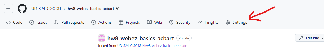
Next, you need to enable Github Pages for your repository. Go to the repository on Github, click on the “Settings” tab.
- Scroll down to the “Github Pages” section.
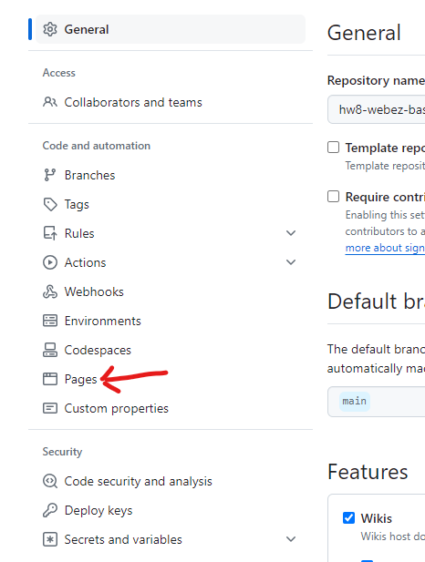
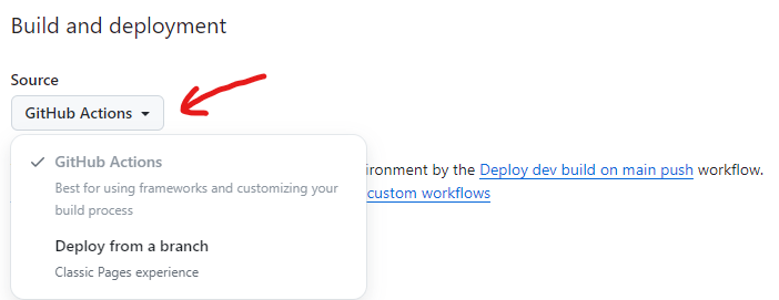
- In the Source dropdown, select “GitHub Actions”.
- Go to the Actions tab and you should see a “workflow” running. This workflow will build and deploy your site to Github Pages. Once the workflow is complete, you should see a link to your site at the top of the page.
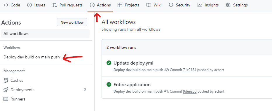
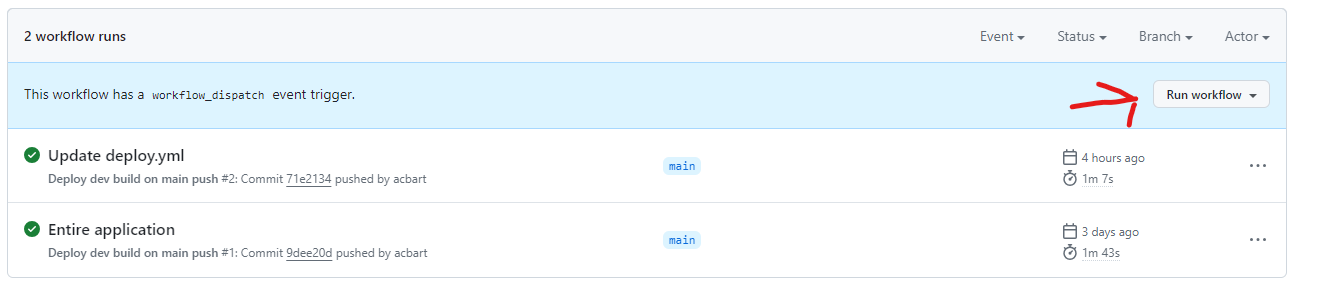
If the workflow doesn’t seem to be running, click “Deploy dev build on main push” and then click “Run workflow”. This will manually trigger the workflow to run, although you may have to reload the page to see it.
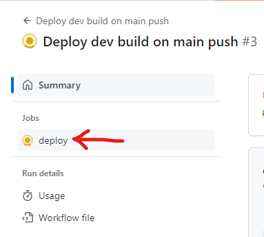
You can check the progress of a workflow by clicking on it:

Click on the “deploy” button on the left sidebar to see the details of the deployment.
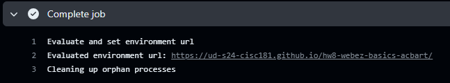
Assuming nothing goes wrong during deployment, the final step can be expanded to get the URL of your live site. Click on the URL to visit your site!
If that URL is not visible, then you can also find the URL by going back to the “Settings” tab and scrolling down to the “Github Pages” section. The URL should be displayed there.
7) Submission
Once you have completed the tutorial and deployed your site, you can submit on GradeScope. If you have any questions or issues, please don’t hesitate to ask for help!
In addition to passing our tests, you will also be graded on the successful deployment of your site. If the site is not deployed, you will not receive credit for the assignment. The TAs and instructors will review your site, your tests, and your code to ensure that you have completed the assignment correctly.
Next Step
Next we’ll learn more features of TypeScript and how to use them in Advanced TypeScript »